All Work

TickerPerks

Repositioning a Shareholder Rewards Platform for the Next Generation of Retail Investors

Summary

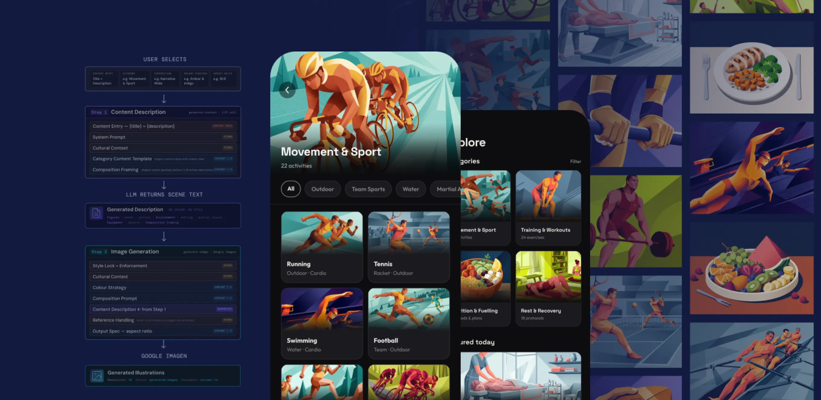
Brought in to lead product design on a full relaunch, taking TickerPerks from a fragmented strategy and a dated brand to a validated, launch-ready product — in under two months. This meant making strategic calls before design began: recommending a rename, resolving the value proposition, and redefining the product architecture around the right user.

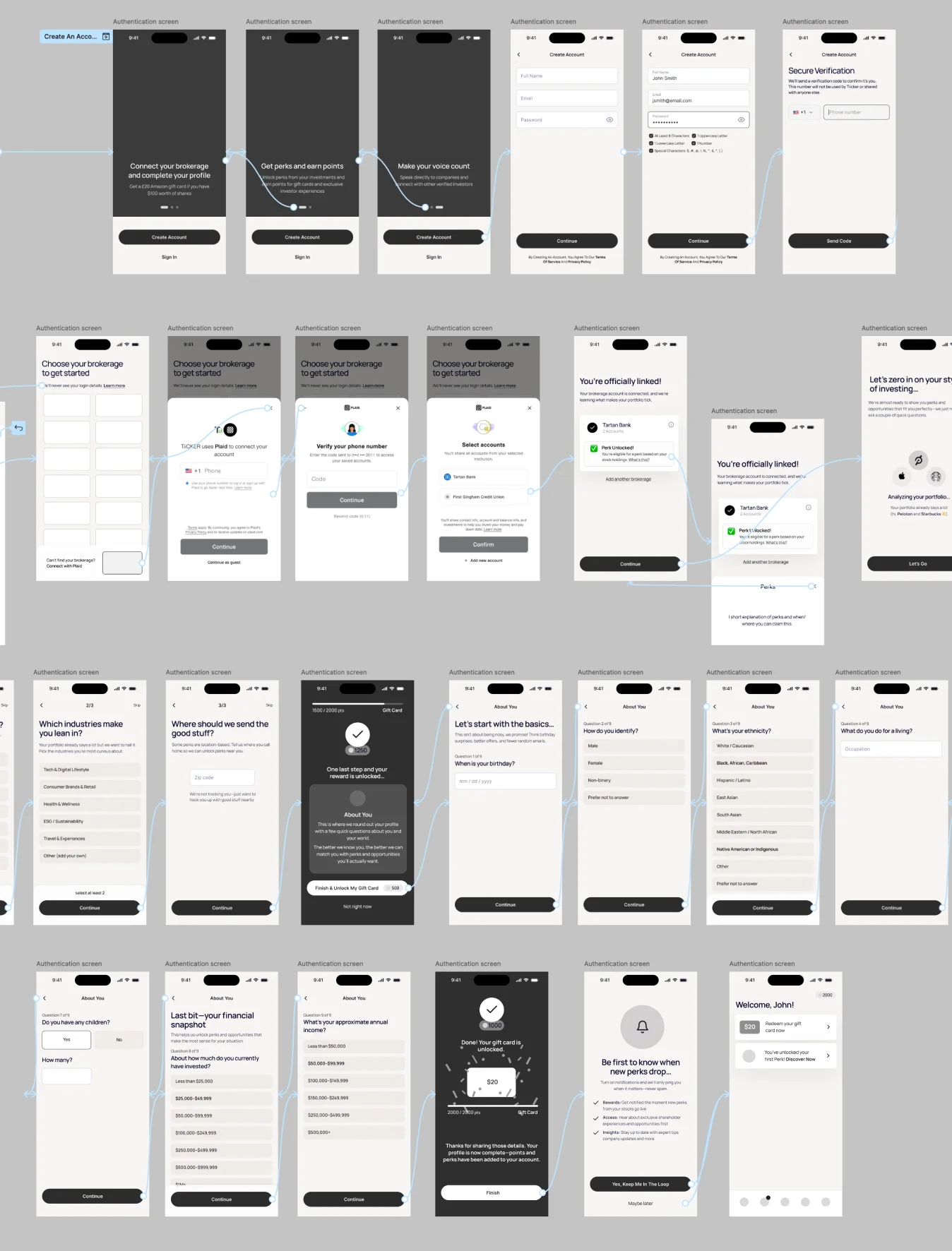
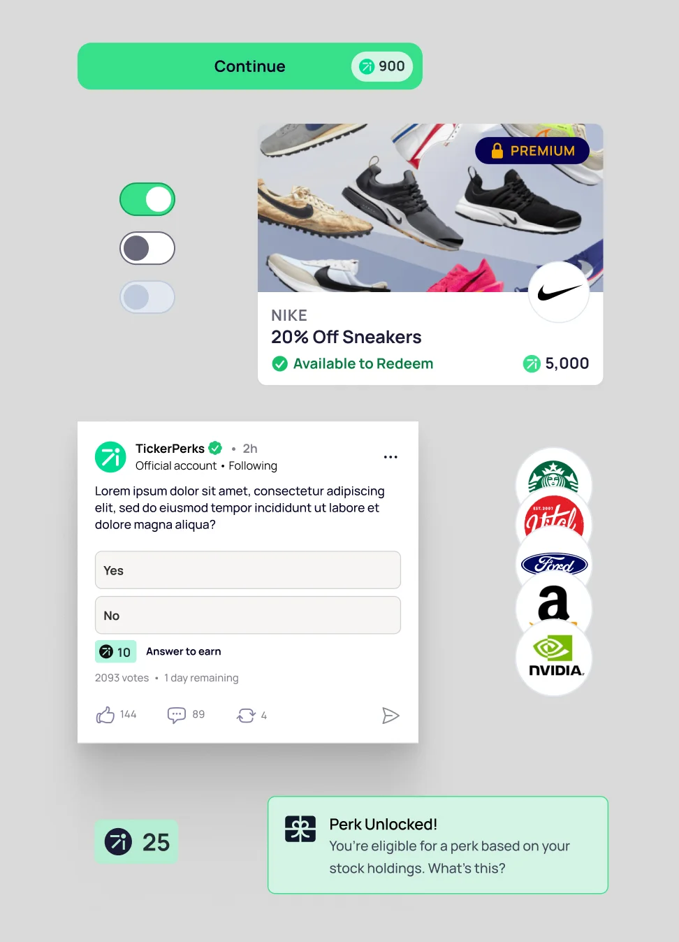
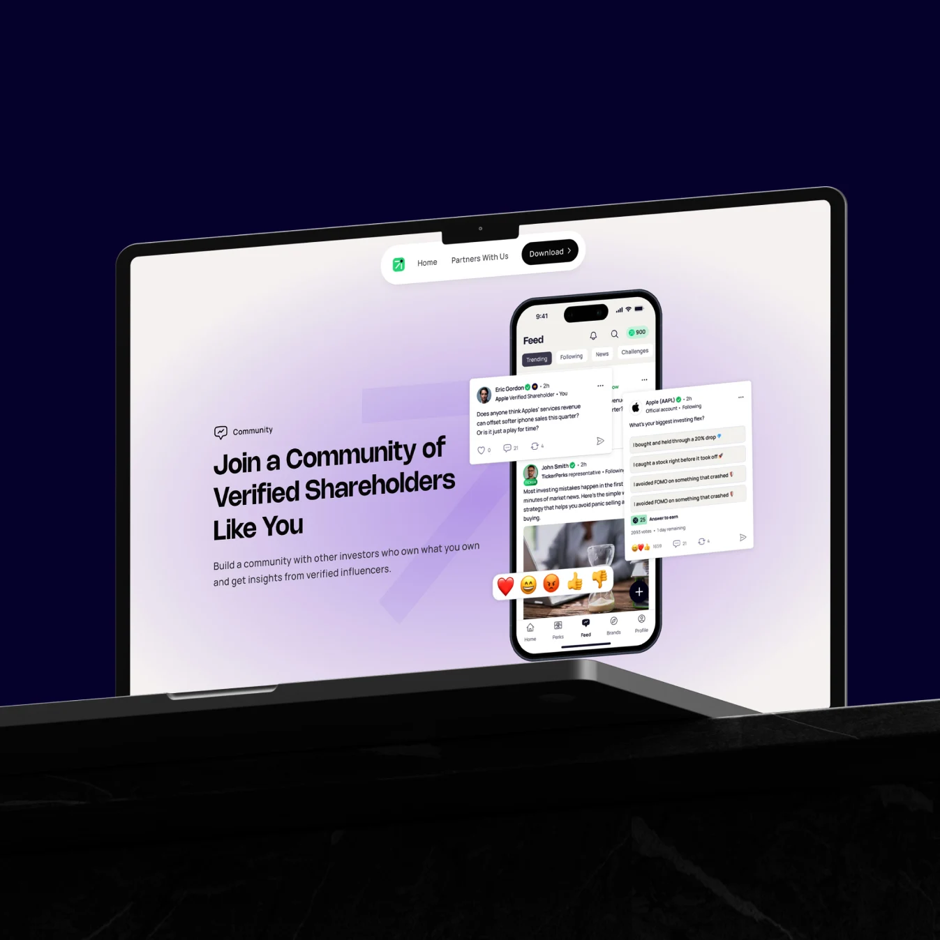
The result is a new brand identity, 80+ screens across all app flows, a component-based design system, a dev-ready handoff, and a Framer marketing website — all validated through user testing ahead of a Q1 2026 launch.

They took the vision and made it real — articulated it visually in a way that makes sense to the user. A great investment in time and money.”

Walter Ward
Walter WardCEO, TickerPerks
Context & Challenge

A Clear Vision. A Product That Hadn't Caught Up.

TickerPerks connects retail shareholders with exclusive perks and community from the brands they invest in. Under new leadership, the ambition was significant: premium membership, mobile-first, community-driven, targeting a younger and increasingly female audience. The existing product was web-first, built for a different era. Onboarding had high drop-off. The rewards model was narrow. And the brand was quietly working against them. When we got into inception, the strategy was less defined than anticipated. Before a single screen was drawn, we slowed down to properly define the value proposition, resolve the product architecture, and make deliberate scope decisions.
Competitive positioning matrixBrand identity exploration
Key Decision (1/4)

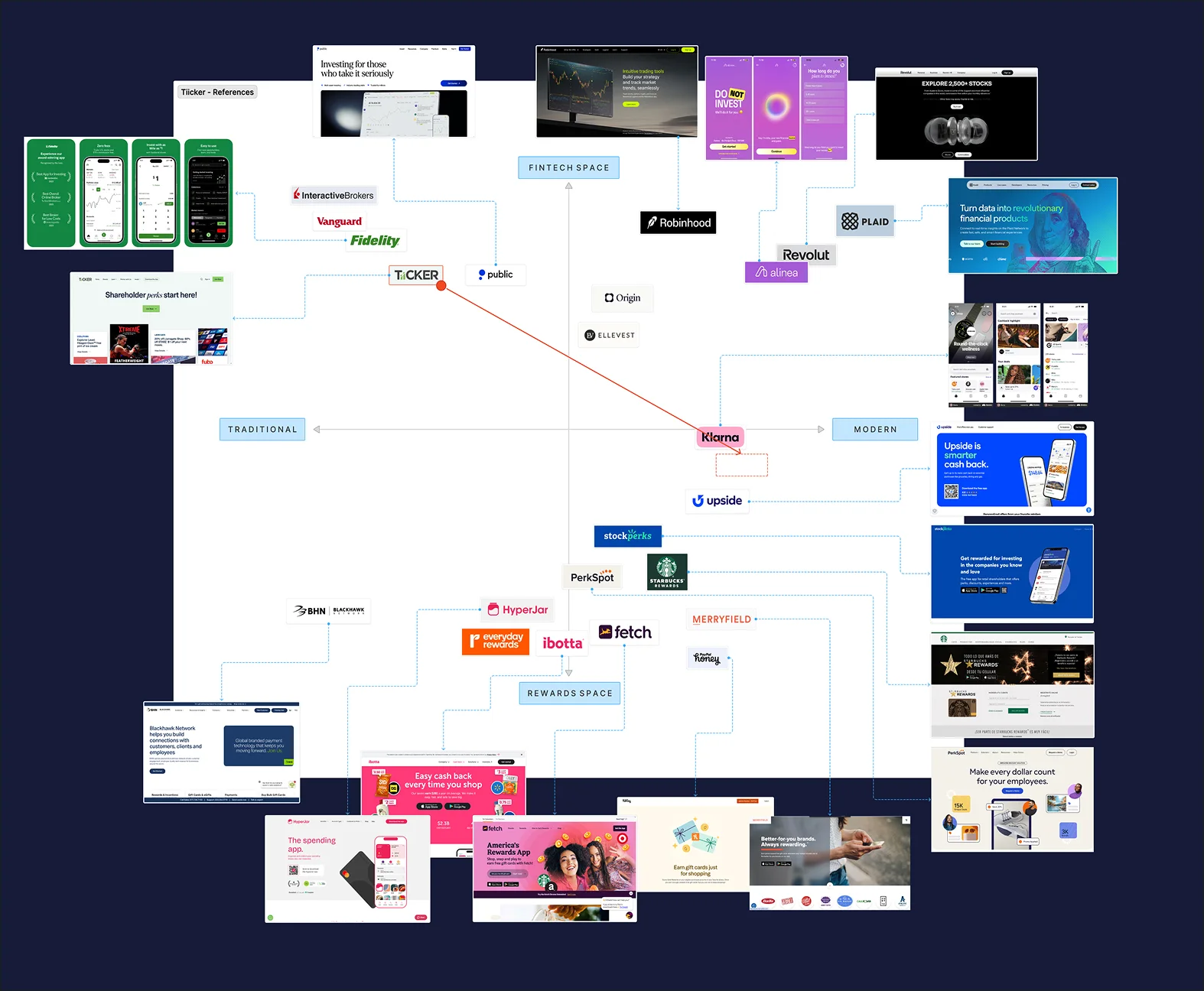
The Name Was Part of the Problem

The “TiiCKER” brand was working against them on multiple fronts. The double-i created near-unsolvable logo problems at small sizes, hurt search discoverability, and was widely misunderstood — most people had no idea what the name referred to. I ran a brand audit and competitive mapping exercise, then raised the rename directly with the client. A name that included “Perks” would immediately communicate what the product does. They agreed — TickerPerks was adopted. From there I led the full brand identity process: brand personality workshops, tone definition, and a visual direction built to feel modern, rewards-forward, and genuinely gender-balanced.
Old TiiCKER logo vs new TickerPerks logo
Key Decision (2/4)

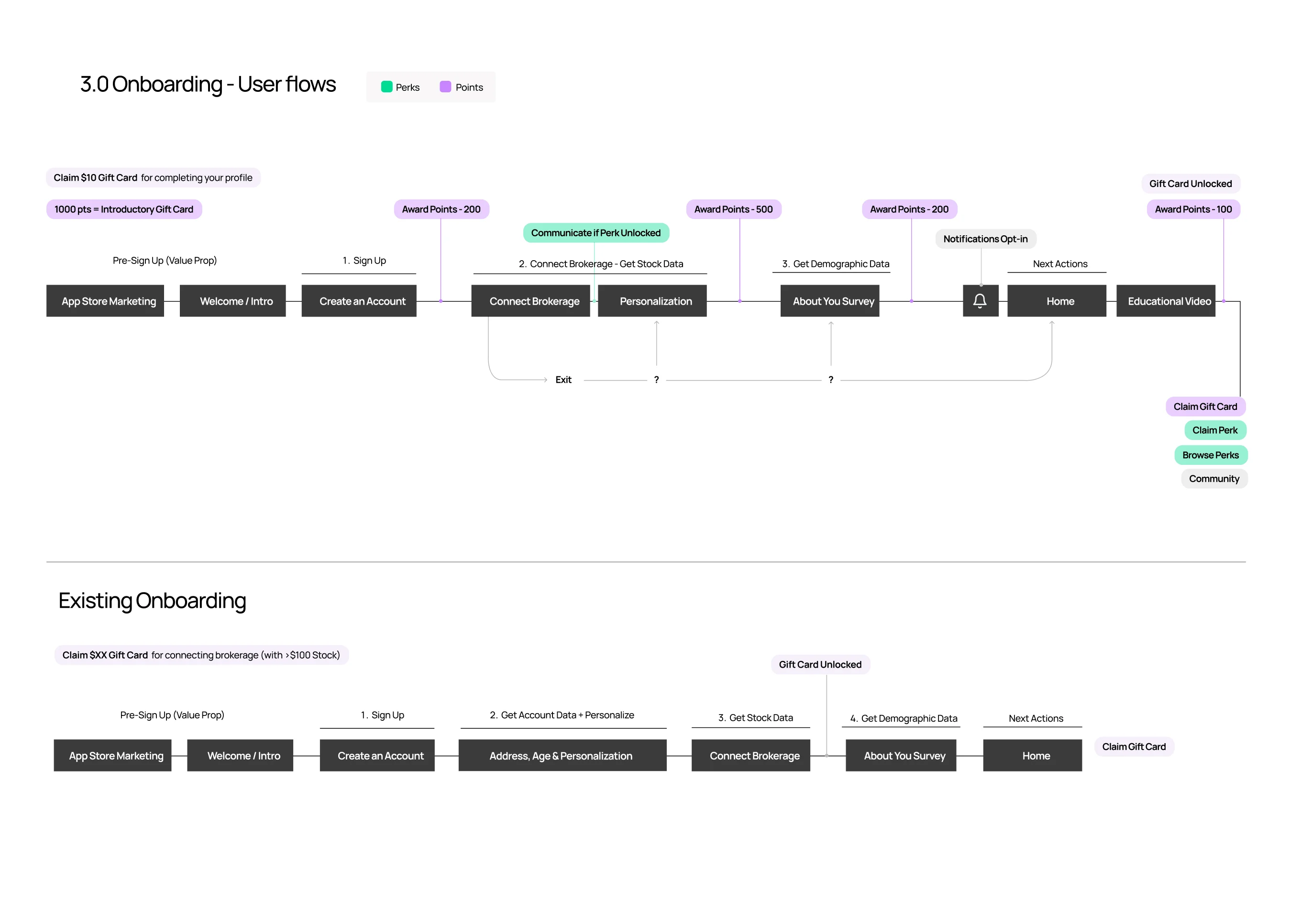
Value Prop First. Onboarding Second.

The previous onboarding flow asked for too much, too soon — a conversion killer in fintech, where users won't connect brokerage accounts until they trust you. But before redesigning the flow, I worked with the product team to properly resolve the underlying value proposition: what does TickerPerks offer, in what order does it matter, and how does the rewards and membership model actually work? Onboarding can only communicate what's been clearly defined. The rebuilt journey uses progressive disclosure — value and credibility first, sensitive data last. User testing confirmed it: participants completed the flow smoothly and felt confident connecting their accounts when asked.
Onboarding user flow
Onboarding wireframes
Key Decision (3/4)

Community Belongs at the Centre, Not Buried Inside It

Community grew in importance throughout the project — but the original architecture buried it inside individual brand sub-pages, Reddit-style. Most users would never find it. I proposed aggregating all community content — threads, posts, social updates — onto a primary feed, surfacing highlights directly on the home screen, and introducing follow mechanics for brands and investors. This turned community from a hidden feature into a core daily engagement driver, and gave brands a direct channel to reach their shareholders — something no other platform enables.
TickerPerks design componentsTickerPerks design system
Key Decision (4/4)

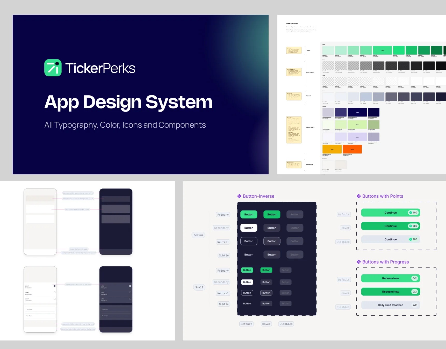
A Handoff Built to Be Built Without Us

Because our team wouldn't be involved in the build phase, the quality of the handoff was critical. A partial or ambiguous delivery at this stage means delays, misinterpretation, and a final product that doesn't match the vision. I led final delivery of 80+ screens with full interaction annotations, a component-based design system for every major flow. We also built the new TickerPerks marketing site in Framer — my recommendation, which let us deliver a premium, brand-consistent site quickly without pulling engineering resource from the app.
Community website design
Outcomes & Impact

“A Quantum Leap”

TickerPerks launches Q1 2026 with a validated product direction, a new brand, and a design system ready to scale. The project is a good illustration of what senior design leadership looks like in practice: knowing when to slow down, resolving strategy before picking up a tool, and delivering something the team can actually build from.

Our previous app was dated. Where we are now is a quantum leap — best in class for a first-of-its-kind tool in the marketplace.”

Walter Ward
Walter WardCEO, TickerPerks

Other Case Studies